
The guide / Stores
Image with Text
StoresSeen in the editor previewAny tile size — Full, Large, Medium, Small; not in a variable-height split row ("This tile can't be added to this section").
Two layouts with two different forms, chosen by Choose section layout. Overlay text (default) Inline text
| Control | Options (default bold) | Desktop | Mobile |
|---|---|---|---|
| Choose section layout | Overlay text · Inline text | Swaps the whole form | — |
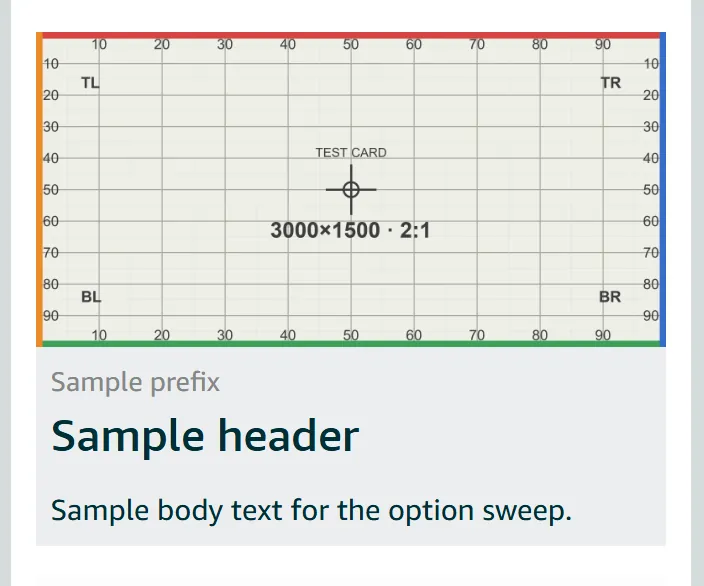
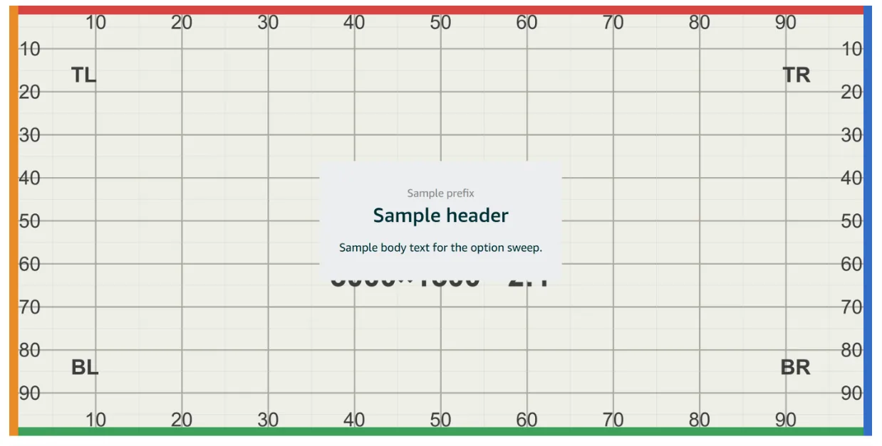
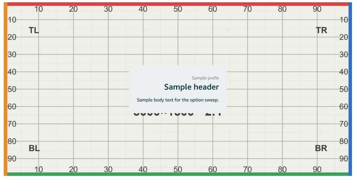
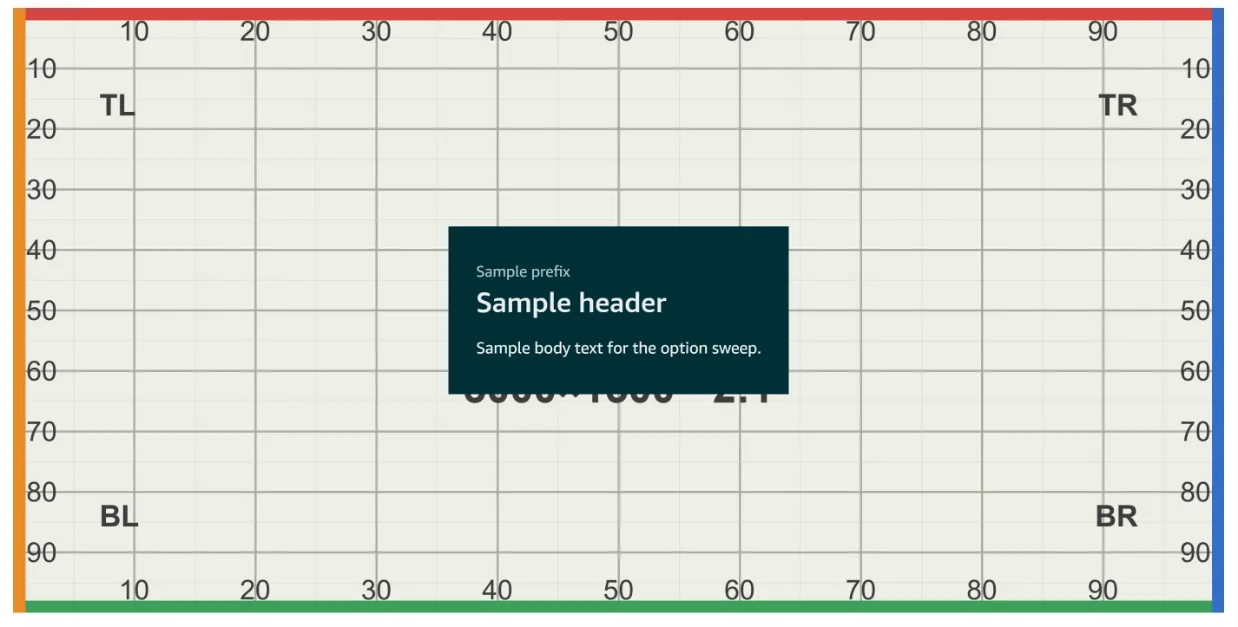
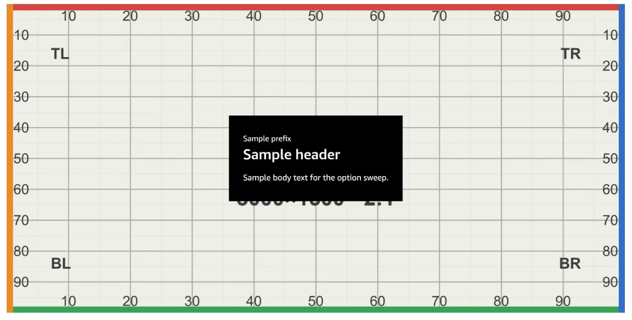
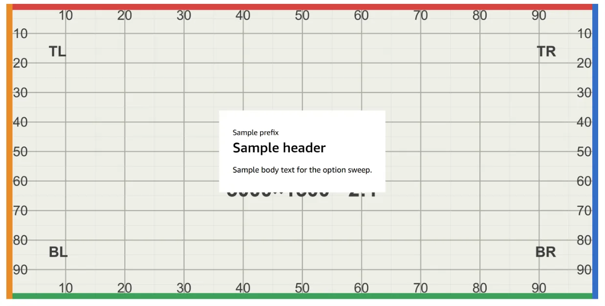
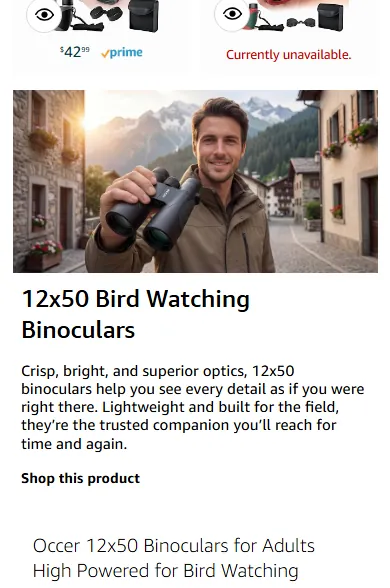
| Prefix · Header · Body | Prefix optional, Header required, Body rich text (Bold, bullets, numbers) | Drawn in a panel over the image (live, occer: Amazon's solid white panel) | Below the image at Full width (live, occer: the same file served at 390×195); in the panel in split tiles |
| Add a link | product / Store page | Bold link text in the panel | Same, below or in panel |
| Text size | Small · Medium · Large | Modest type steps; the panel grows with the text. In a Small tile the panel barely shrinks | Same steps |
| Show advanced options | hidden by default | Everything below sits behind this link | — |
| Text alignment | left · centre · right · justify (default not recorded) | Aligns text inside the panel; the panel doesn't move | Same |
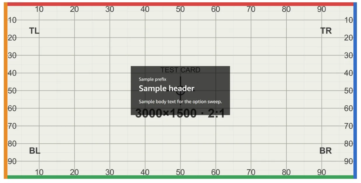
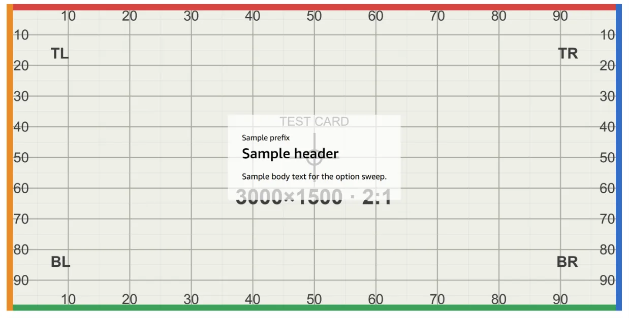
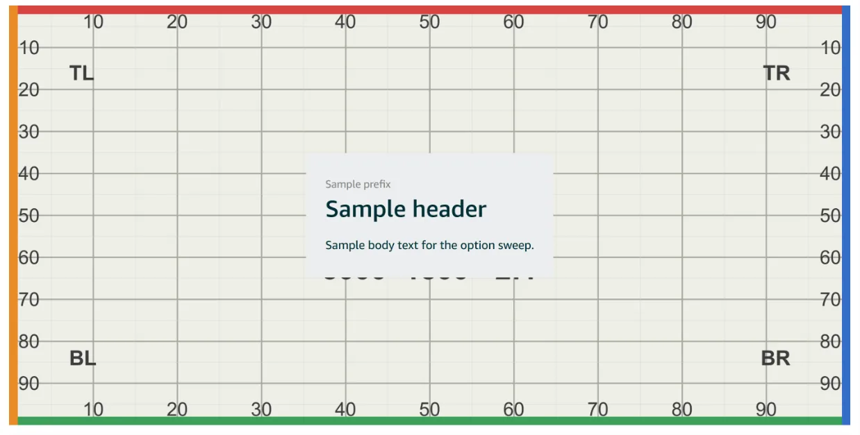
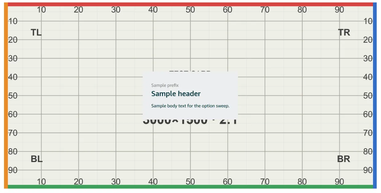
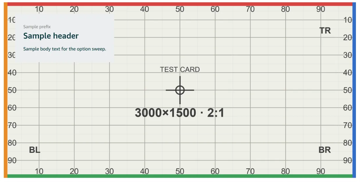
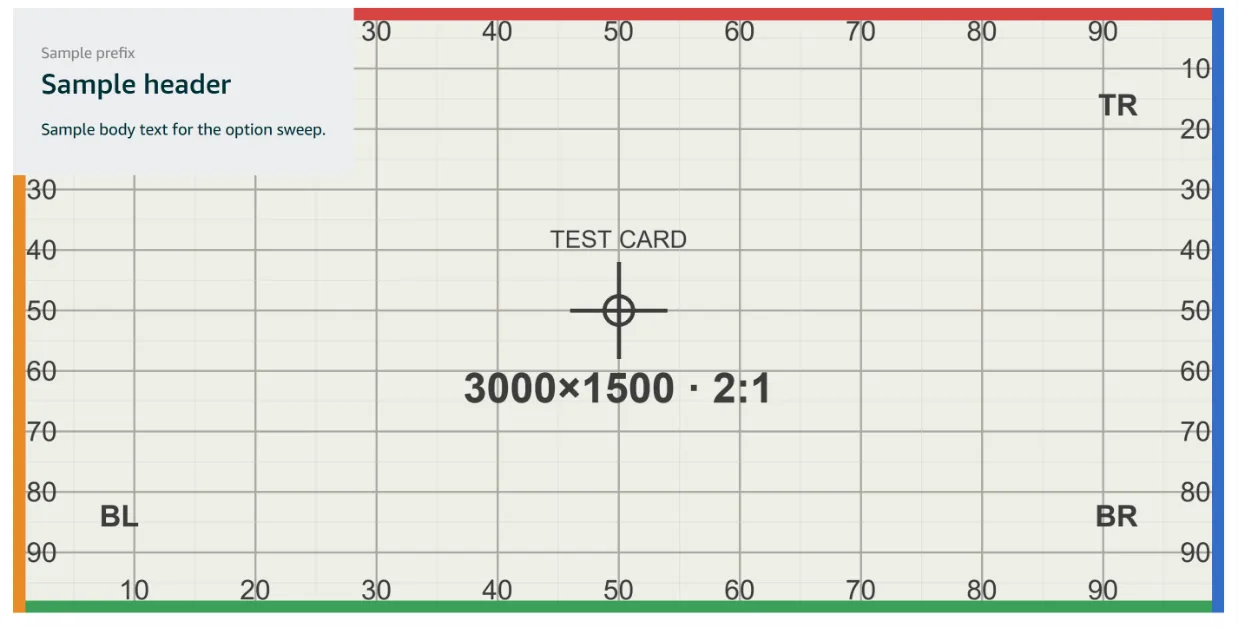
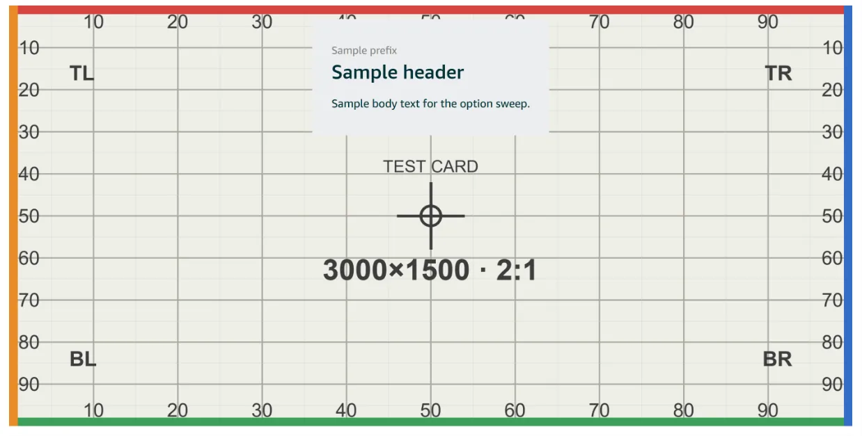
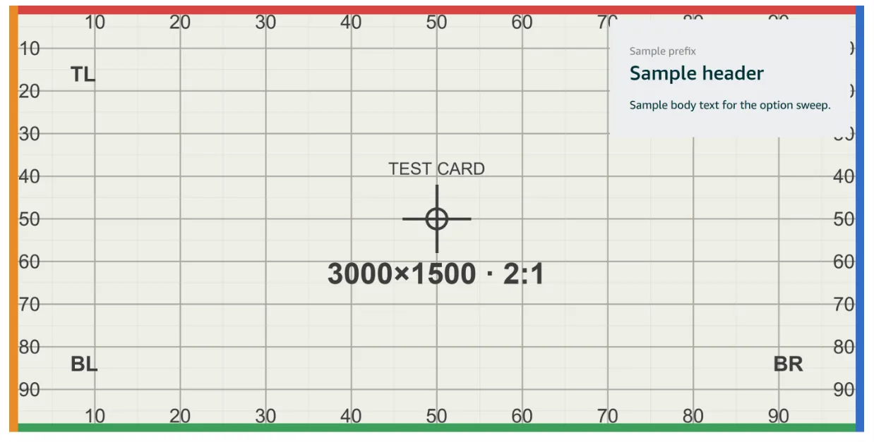
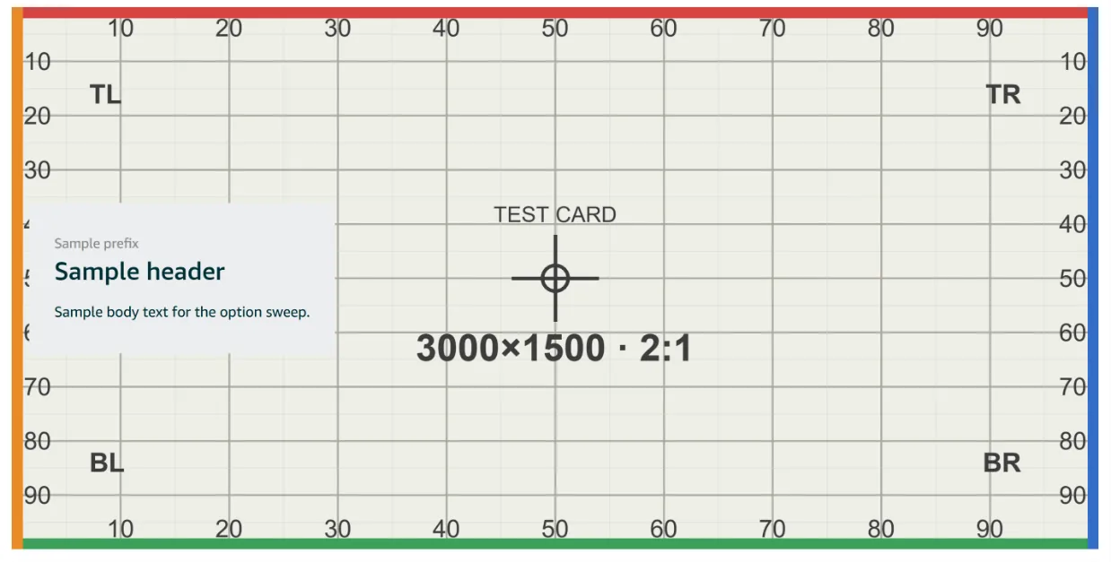
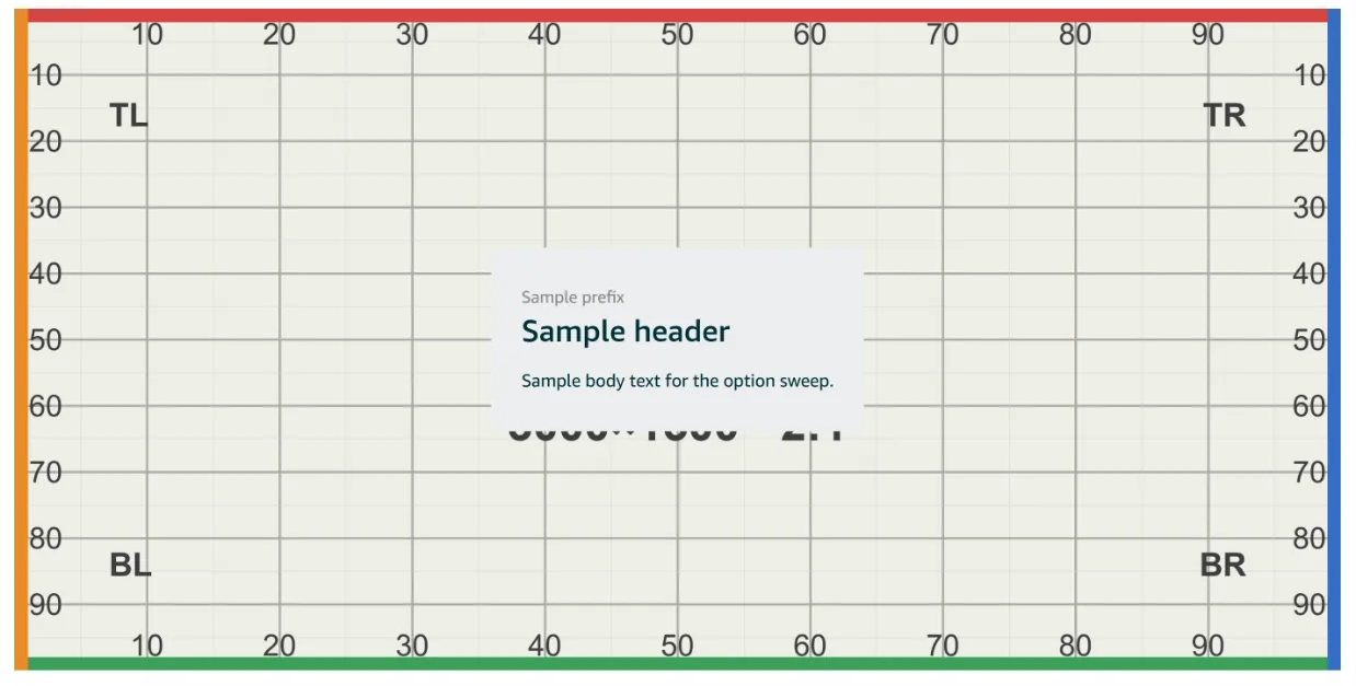
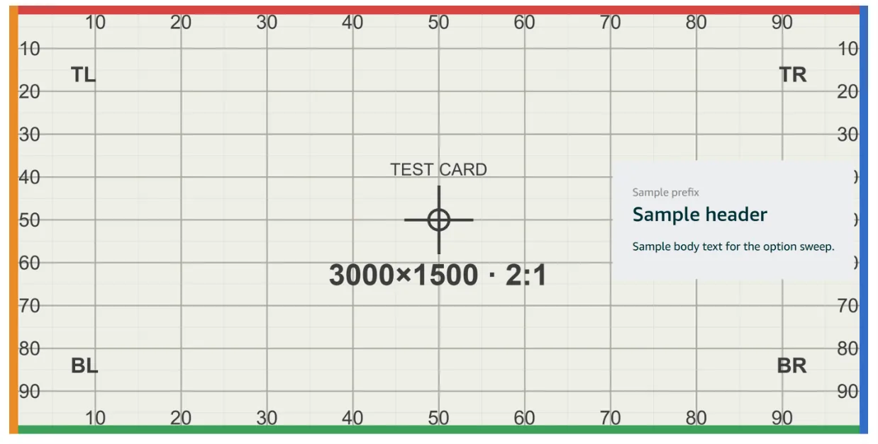
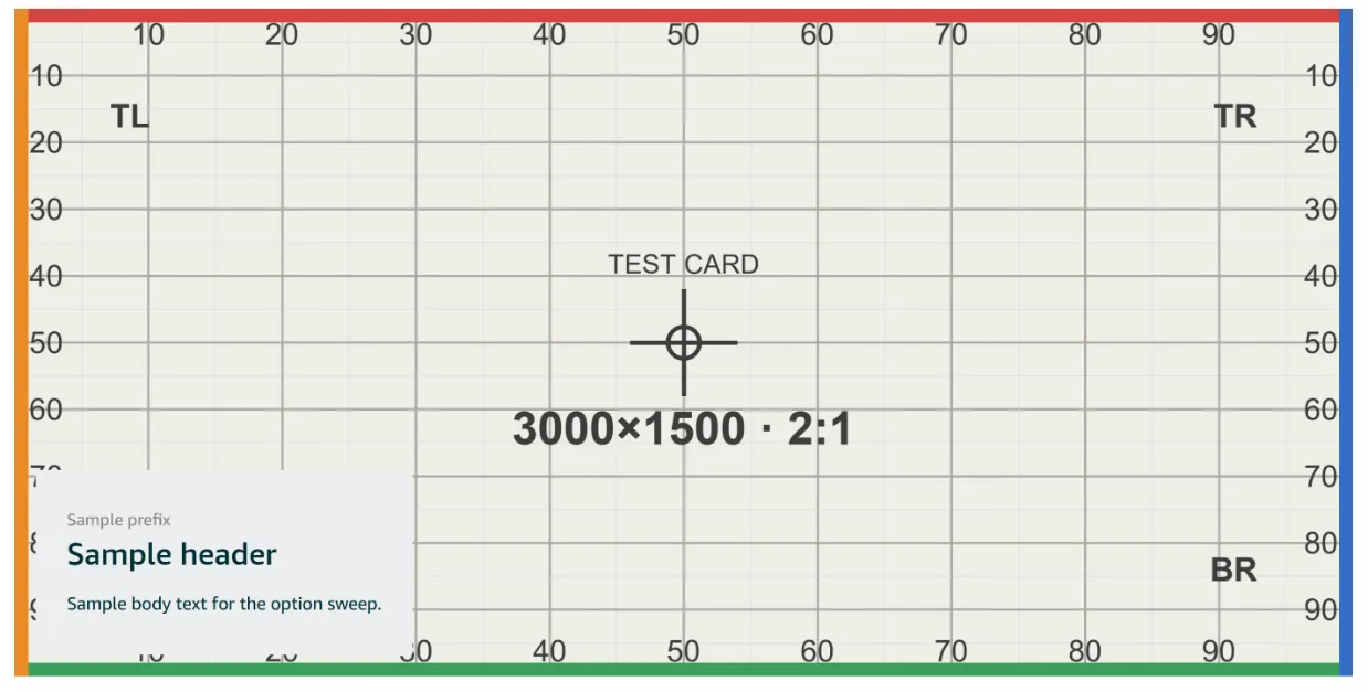
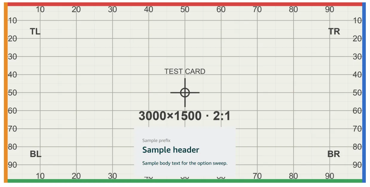
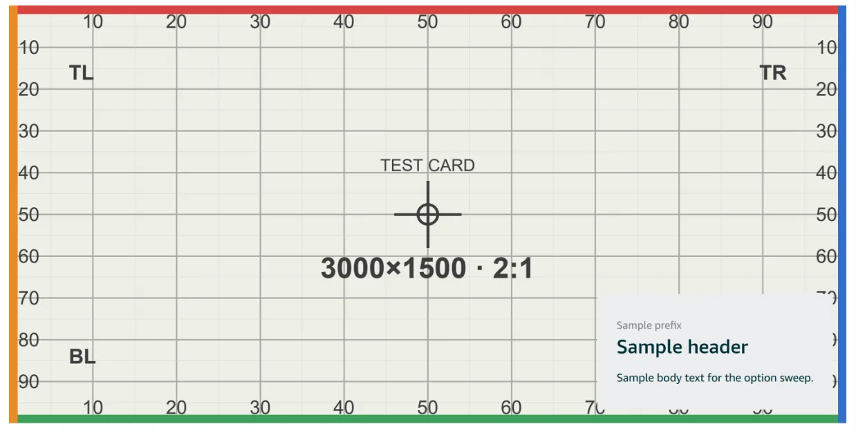
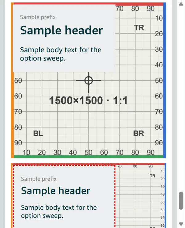
| Position | 3 × 3 grid, top-left | Places the panel; at Medium ≈ 28% × 28% of a 2:1 tile | No effect at Full width (text drops below); in split tiles the panel stays top-left |
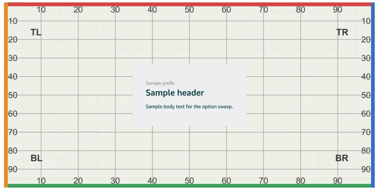
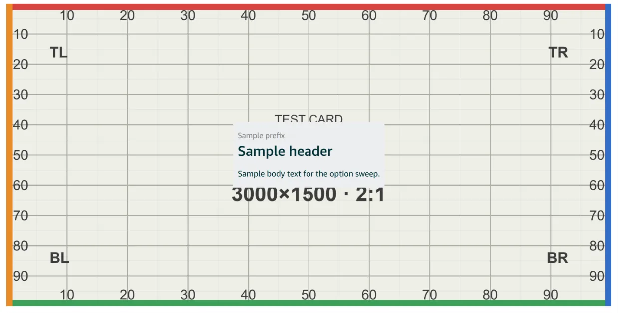
| Color | Default (fresh tiles render it) · Default inverted · Solid white · Solid black · Translucent white · Translucent black | Panel and text together: light grey/dark teal · dark teal/white · white/black · black/white · see-through panels (image shows behind the text) | Panel colour carries to the block below the image |
| Padding | Small · Medium · Large (default not recorded) | Inner space round the text; Large at centre ≈ 34–66% W × 34–67% H | As desktop |
| Distance from edge | None · Small · Medium · Large (default not recorded) | Shown only when Position ≠ centre. None = flush to the corner; Large ≈ 3% inset | — |
| Mobile / Desktop image tabs | upload + crop | "'Overlay text' section layout requires the same image and same crop on desktop and mobile." — one image, one crop, both breakpoints | — |
| Control | Options (default bold) | Desktop | Mobile |
|---|---|---|---|
| Title | required, line-metered | Text column, left | The only text shown — "Will only display title on small screens." |
| Text | optional, line-metered | Under the title | Dropped |
| Text alignment | left · right | Column alignment | — |
| Image scale | none · side · corner · all | The image column (≈ 35% of tile width, right): all scales up and bleeds off the right edge — only ≈ 0–63% of the image's width shows | Not applied — the mobile image is its own art |
| Image (per tab) | desktop + its own mobile image | Right-hand column | Own art whole, title below |
| Add a link | — | "A link is required with the use of an image title." | — |
Text Amazon's face; no font family, no free colour — only the six Color presets. Overlay meters: none shown. Inline meters count lines, warn but don't block.
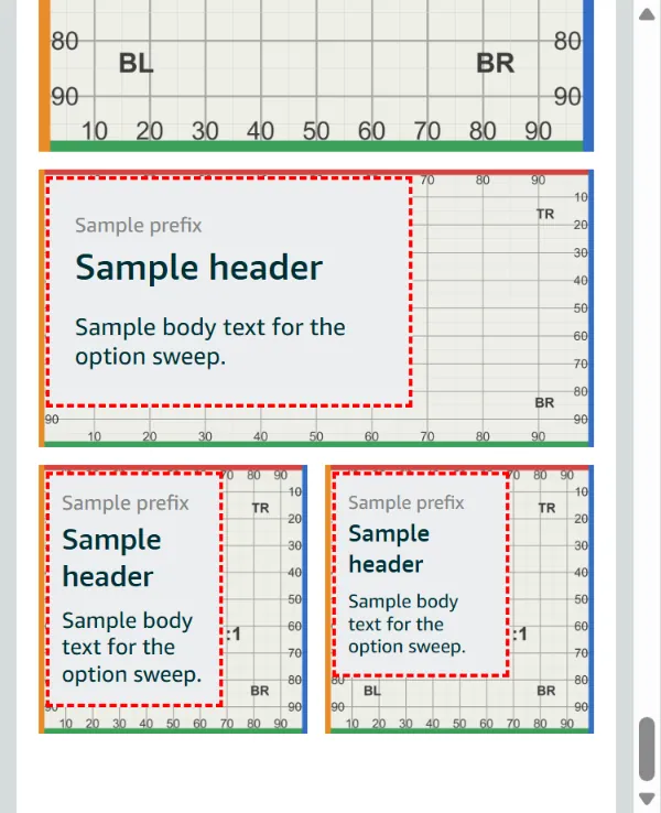
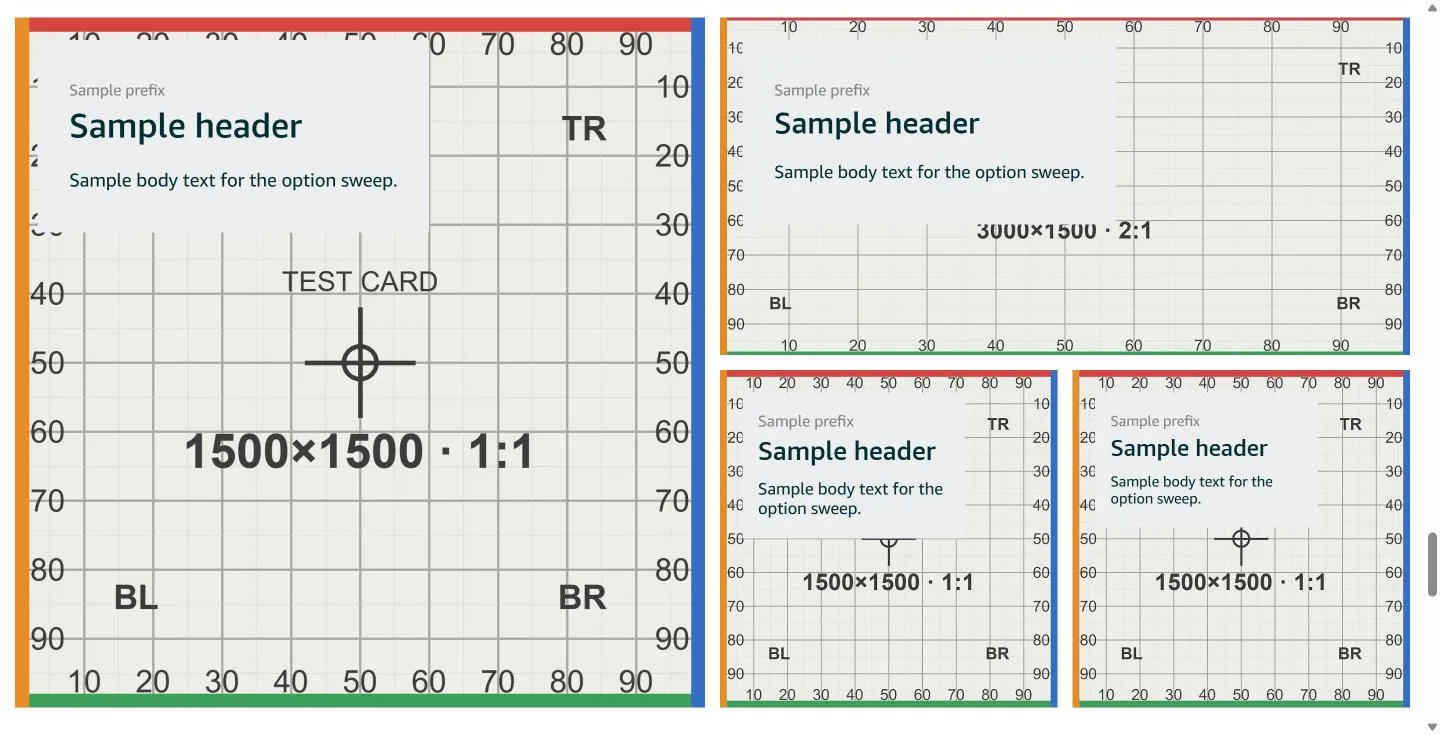
Cropped or covered Overlay — the panel covers its 3 × 3 cell (≈ 28% × 28% at Medium; up to 66% W × 87% H in a Small tile on phones). Split tiles on phones: Medium and Small panels cover most of the tile (builder 2026-10-16, L + M + S+S row, prefix + header + one body line — phone tiles Large 315² · Medium 315×158 · Small 153² side by side; panels ≈ 60% W × 45% H Large, 62% × 83% Medium, 66% × 87% Small; desktop panels ≈ 58% W Large, 54% Medium, 66% Small), and the builder outlines the text in a red dashed box (TextTileLayer__outOfBounds) — a visual warning only. Inline all — the right ≈ 37% of the image is cut.
Good to know Overlay is an overlay on desktop only at Full width; in split tiles it stays overlaid on phones too. Translucent white / Translucent black panels show the image behind the text, so busy art fights legibility. Rare live: 9 rows on 5 of 106 Store pages. Inline renders like the Image tile's Text layout (desktop text column left, image right; phones own art whole, title below).
The editor form 2
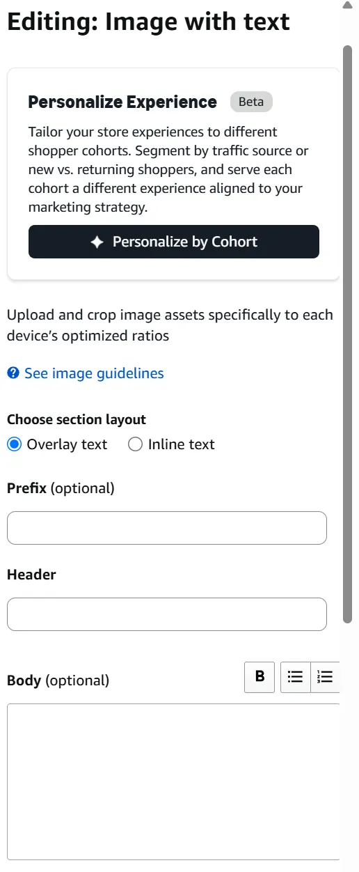
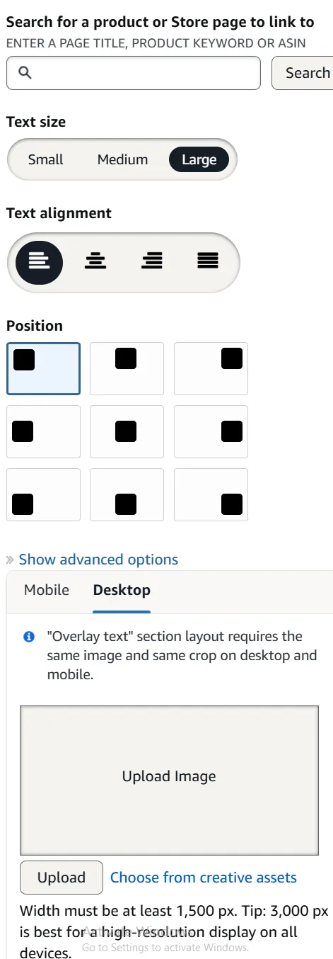
Option by option, in Amazon's preview 29
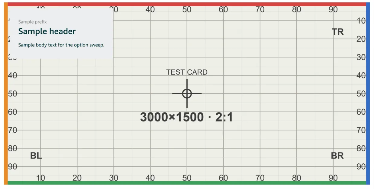
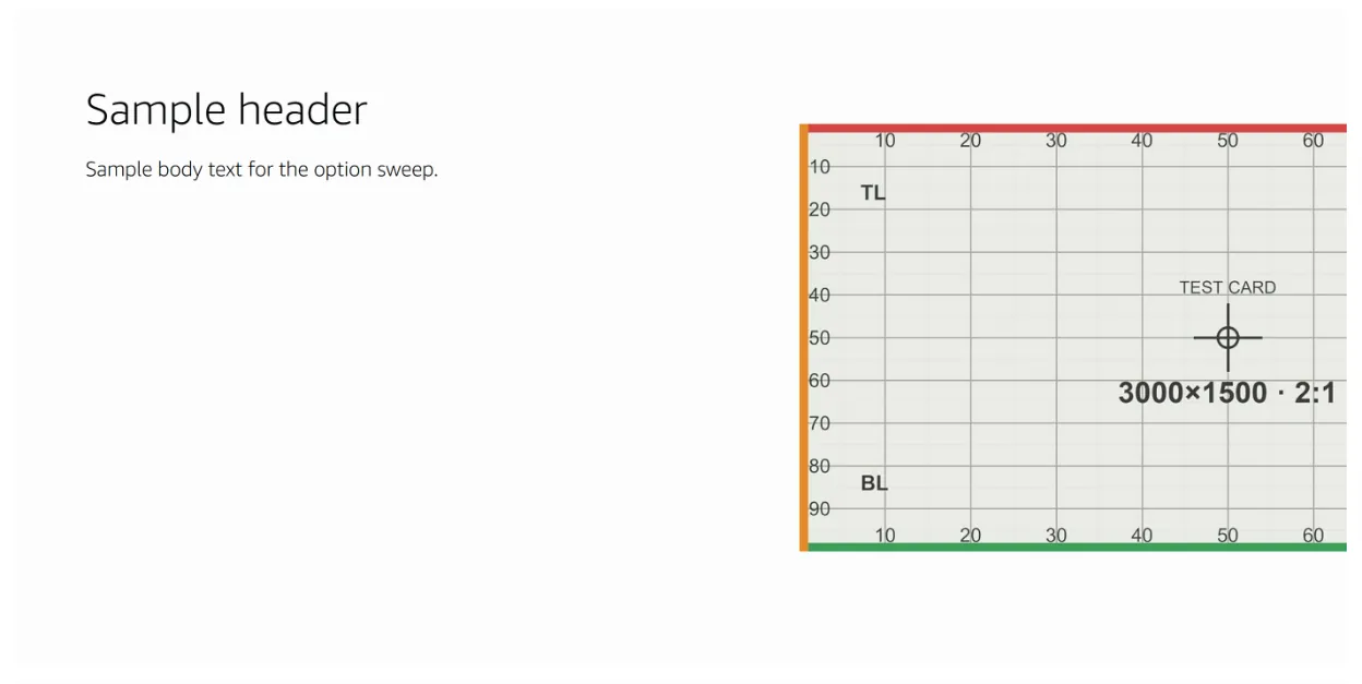
Live on amazon.com 2
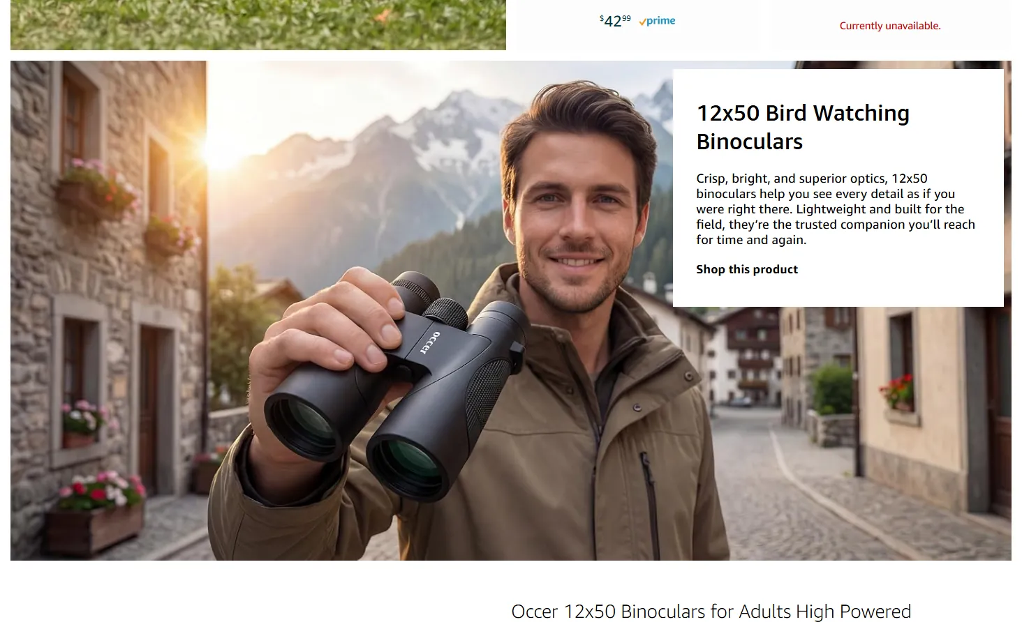
This is one of 59 entries
The full guide has every A+ module, Brand Story card and Brand Store section, with the same detail.
Get the full guideAn unofficial guide, not affiliated with or endorsed by Amazon. Amazon, A+ Content and Brand Stores are Amazon's. Amazon changes its editors without notice; every entry carries the date it was last checked.
Sizes, file rules and character limits are not covered here. Check them in Seller Central before you upload.