
The guide / Standard A+
Image & Dark Text Overlay
Standard A+Seen in the editor previewA Standard A+ project; can repeat.
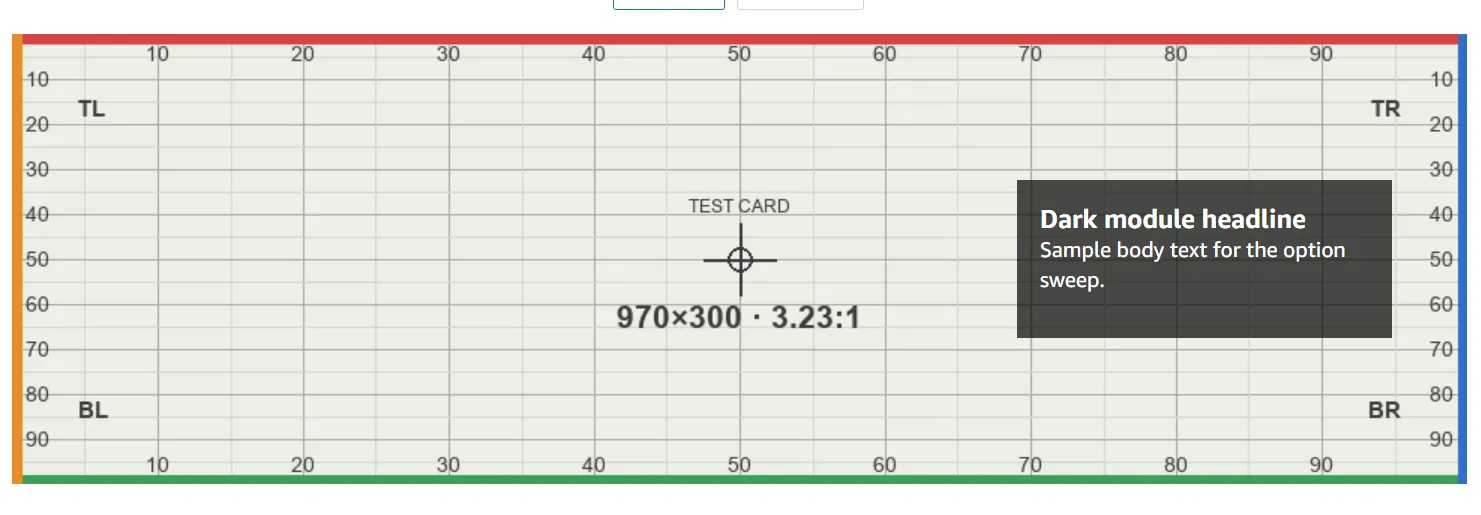
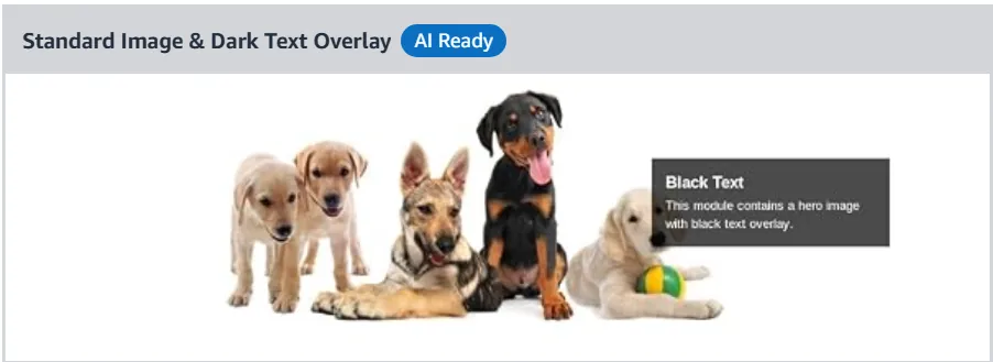
Renders a dark translucent panel with WHITE text — the name describes the panel, not the type.
| Control | Options (default bold) | Desktop | Mobile |
|---|---|---|---|
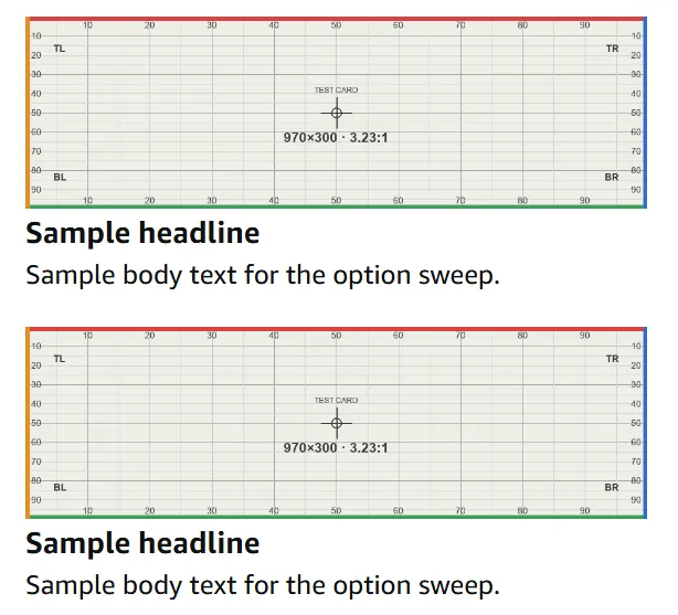
| Headline · Body | text · rich text | In a dark translucent panel, white type, on the right (≈ 69–95% W, 31–68% H) | No overlay: the whole image, then Headline + Body below on white — identical to Light |
| Background image | single slot, no mobile image; added via an Add Image modal: * Add image · *-marked Alt text · Generate image | The file at native width, all edges | The whole image, scaled (live 360×111) |
| Panel side | no control in the form — DOM apm-heromodule-textright | Always right | — |
| Generate image (modal) | button | not tested | — |
| AI Ready | Select content to generate | not tested | — |
Text Amazon-rendered, white on the dark panel; no colour, size or position control. With both fields empty Amazon omits the text container entirely — the module renders as a plain banner.
Cropped or covered desktop — the panel covers ≈ 69–95% W × 31–68% H of the image; nothing cropped. Phones — nothing covered (text moves below).
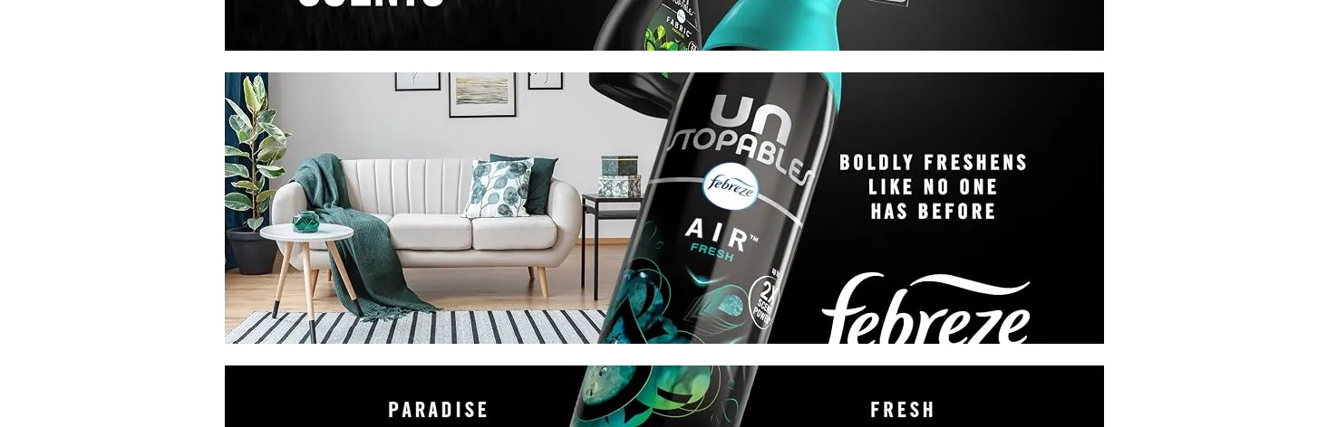
Good to know Amazon's own chooser thumbnail draws the dark box but captions it "Black Text … black text overlay" — Amazon's label contradicts its render. Live, the type is used text-free: 0 of 165 instances carried text (Light: 9 of 114); stacked instances sit ≈ 24 px apart on white. Dark and Light differ only on desktop.
The editor form 2
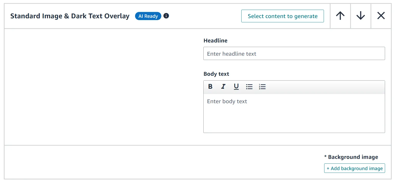
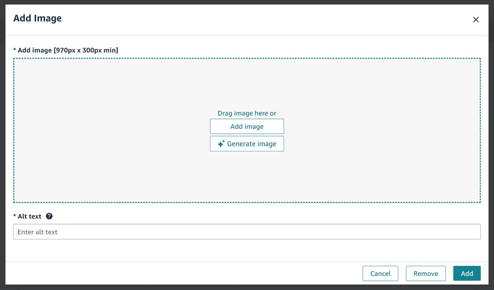
Option by option, in Amazon's preview 4
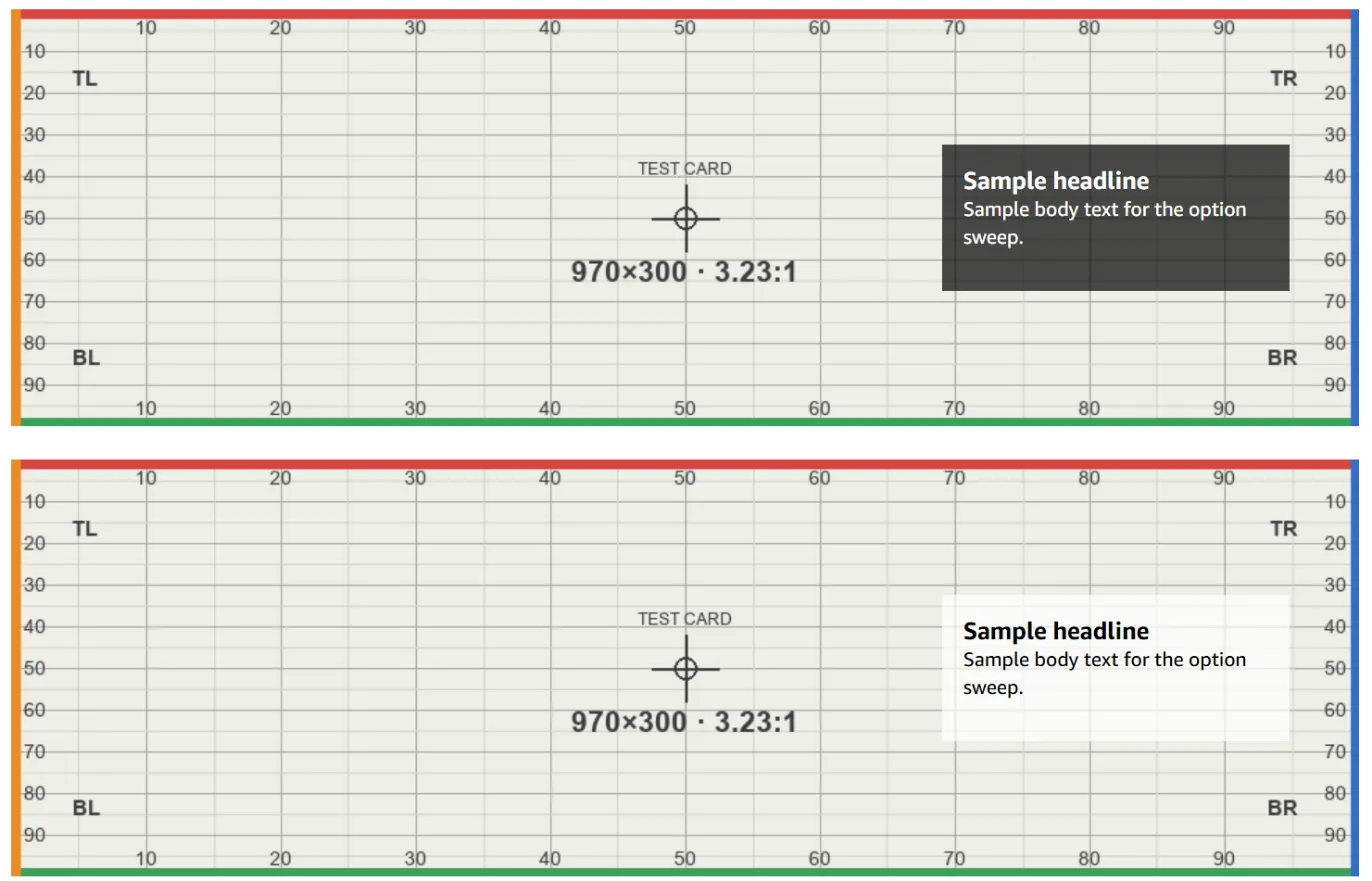
Live on amazon.com 2
This is one of 59 entries
The full guide has every A+ module, Brand Story card and Brand Store section, with the same detail.
Get the full guideAn unofficial guide, not affiliated with or endorsed by Amazon. Amazon, A+ Content and Brand Stores are Amazon's. Amazon changes its editors without notice; every entry carries the date it was last checked.
Sizes, file rules and character limits are not covered here. Check them in Seller Central before you upload.