
The guide / Brand Story
Brand Story carousel
Brand StorySeen in the editor previewOne row above the A+ content, the "From the brand" row. The carousel is the row, not a single card: a Brand Carousel Background plus the cards added after it.
| Control | Options (default bold) | Desktop | Mobile |
|---|---|---|---|
| Card count | minimum 1 — the Brand Carousel Background; card types can repeat; 9 cards added and working. Maximum not read | A live page carried the background + 6 cards; cards past the frame edge show only when paged to | Cards in a swipe row, dots below |
| Add Module | ASIN & Store Showcase · Focus Image · Logo & Description · Q&A (the four offered after the background) | Each adds one card to the row | Same |
| ↑ ↓ ✕ on a card | move up / move down / remove; the Background card shows a padlock instead | not tested | not tested |
| Background headline + body | empty · filled | No layout change — the cards don't move | Empty: the first card is already scrolled in over the mobile background (2 dots with two cards). Filled: the background is its own first slide, the first card peeks in from the right (3 dots) |
Text each card draws its own; see the card entries. Amazon's face throughout.
Cropped or covered desktop — the background draws at native width, all bands; the cards start ≈ 32% W, tops ≈ 24% H (editor preview 2026-10-16; corrected 2026-10-22 — 15% was a misread; measured on the filed capture), and run to its foot, covering its right two-thirds. The background stays fixed while the cards slide over it, so what shows depends on carousel position; only a top band (~150 px on desktop) is never covered (live: zaa, gallery 2026-10-03). Mobile — with background text empty, the first card covers nearly all of the background, leaving a top band. Cards draw smaller on phones (served 293×367 on a live page — proportion evidence only).
Good to know desktop paging is ‹ › arrows at the row's edges; mobile is swipe + dots. On phones with background text empty, the first card — not the background — is the first thing seen.
Option by option, in Amazon's preview 4
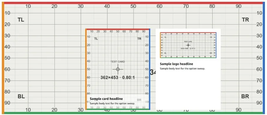
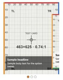
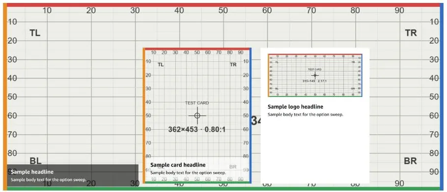
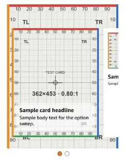
Live on amazon.com 3
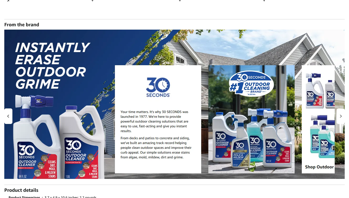
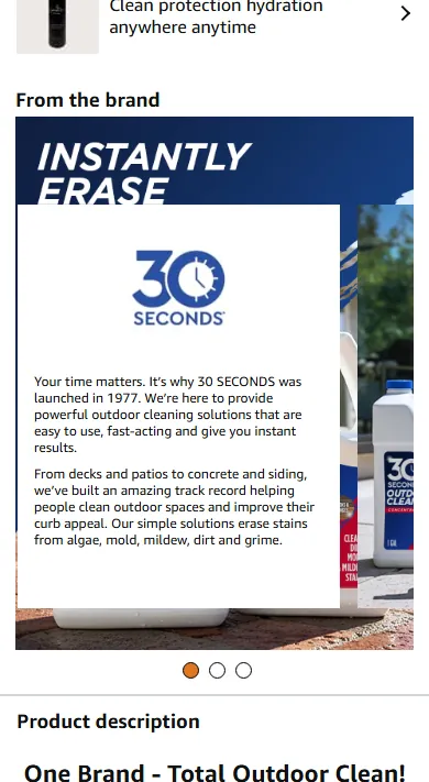

This is one of 59 entries
The full guide has every A+ module, Brand Story card and Brand Store section, with the same detail.
Get the full guideAn unofficial guide, not affiliated with or endorsed by Amazon. Amazon, A+ Content and Brand Stores are Amazon's. Amazon changes its editors without notice; every entry carries the date it was last checked.
Sizes, file rules and character limits are not covered here. Check them in Seller Central before you upload.